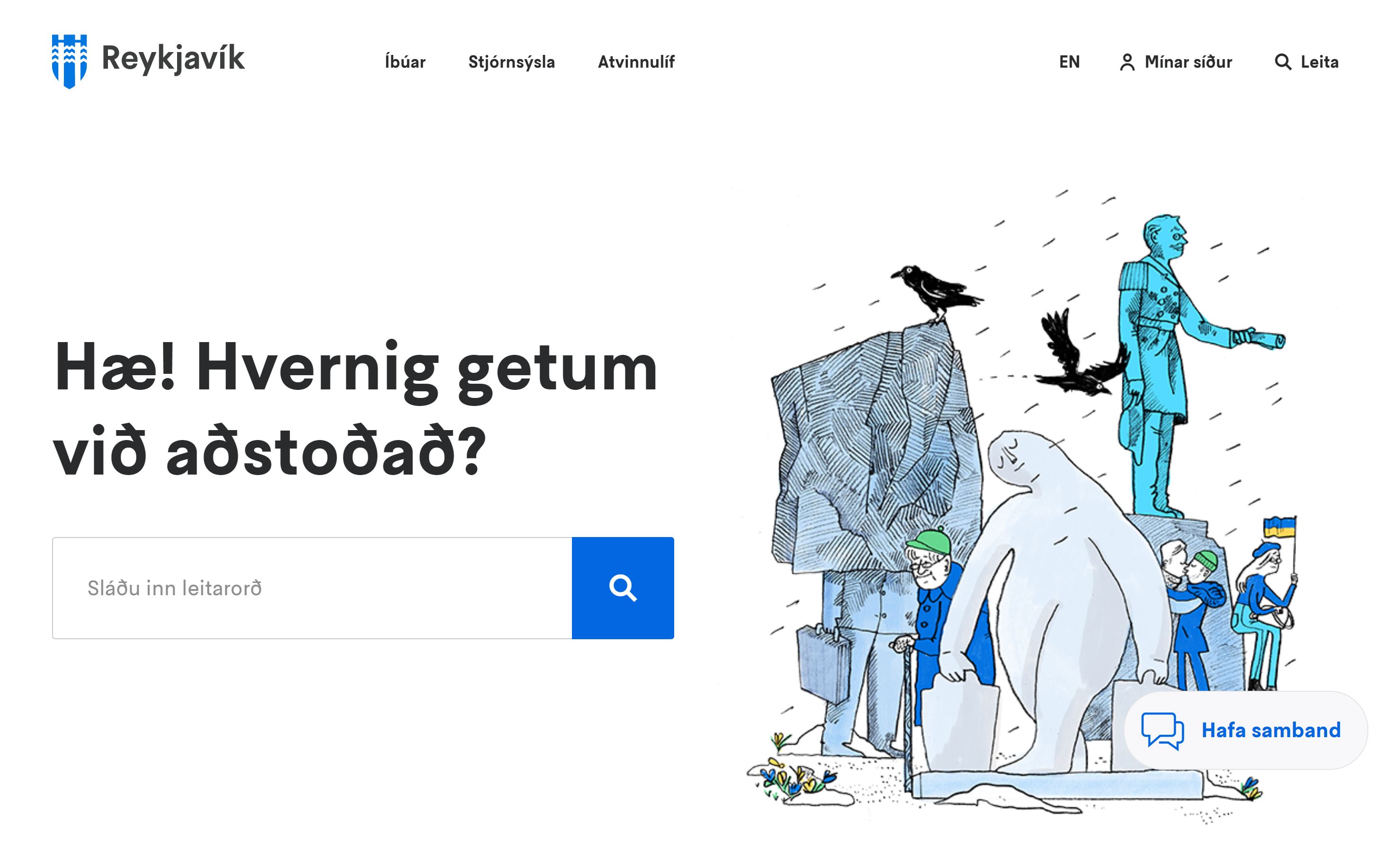
Reykjavík.is
A new version of reykjavik.is was launched at the beginning of 2022. reykjavik.is is the main website of the City, aimed to provide comprehensive services and be the information source for all residents. Emphasis is increased on accessible self-service and simple presentation of information, based on the principles of inclusive design.
The project
The project involved rebuilding the Reykjavík City website from scratch in line with the City's Service Policy. Last year, the Reykjavík City website had nearly two million visits, making it one of the most visited sites in the country.
The project was carried out in extensive consultation with various stakeholders, emphasizing simplicity, inclusive design, accessible information, and ensuring each web page could act as a standalone landing page that answers user queries.
Screenshots
Service design
The website design is based on user-centered design philosophy, emphasizing dialogue with service users at all stages. Information presentation and interfaces were thoroughly tested before the actual construction of the website began.
User needs and circumstances were considered everywhere. In this context, fully formed user archetypes were developed based on user research results.
With these archetypes in mind, all the content of the website was recategorized and then rewritten. The aim was to facilitate users in finding information easily and to ensure potential next steps were always within reach.
My Pages
In parallel with reykjavik.is, new My Pages were set up. My Pages is a web portal for those who seek services from Reykjavík City. We're working to digitize more processes and the current version of My Pages is the first edition or framework for upcoming projects.
The goal is to offer reliable and simple My Pages that follow the same design as the new Reykjavík City website. Thus, users have a seamless experience when switching between the website and My Pages, despite different back end systems.
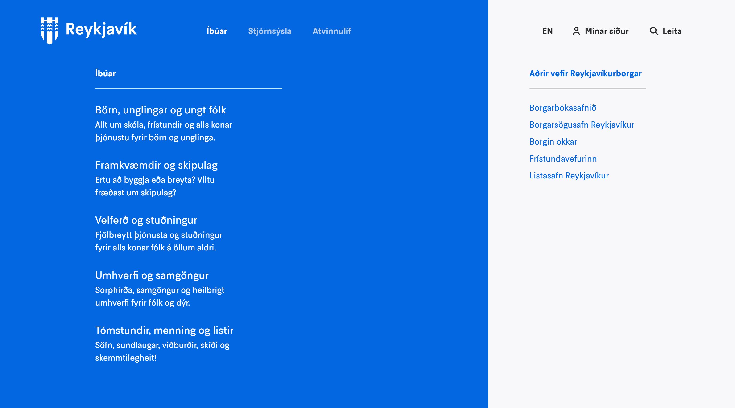
Content management
The Reykjavík City website is extensive, contains many sub-pages, and must appeal to many different target groups. Multiple staff members handle content input for the site, so from the outset, it was clear a lot of work would go into shaping and defining content policy and tone for the City's website.
A major task was undertaken to rewrite all the content of the site, following the rules on presentation and tone from the City's brand new design system - Hanna.
Reykjavík City's tone follows these values:
-
Trustworthy
Users must be able to trust the information provided by the website. Likewise, we must avoid overly institutional, dry, and inaccessible language. A fine, but important, line. -
Friendly
Everything we say and do on behalf of the City is a conversation we're having with its residents, the users of the services we offer. We show patience in our interactions and explain things in layman's terms, without seeming condescending or overly simplistic. -
Colorful
The group that Reykjavík City serves is diverse and colorful. It includes different individuals from various backgrounds, all of whom deserve easily understandable information at their convenience. Therefore, our tone is light and readable, without unnecessary antics.
The outcome of this content work can be seen on reykjavik.is, where the presentation of content has been revolutionized compared to what it was. We've ensured consistency in language, tone, and feel of all content.
However, it's crucial to remember that the website is a living project and will continue to undergo improvements and iterations, making it as simple and effective as possible.
Digital style and appearance
As we developed the digital presence of Reykjavík City, we aimed to modernize and simplify the City's logo to better suit digital platforms.
The website utilizes five distinct color palettes, all built upon the values of Reykjavík. These palettes range from trustful to colorful, establishing a design coherence throughout the color scheme, form, and illustrations.
We drew upon a 12-column grid for design, inspired by classic examples from the urban landscape.
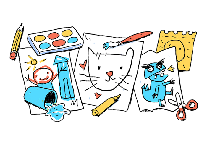
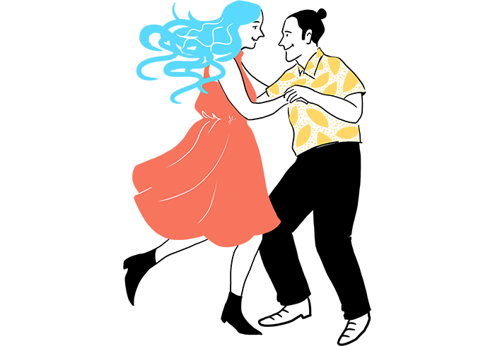
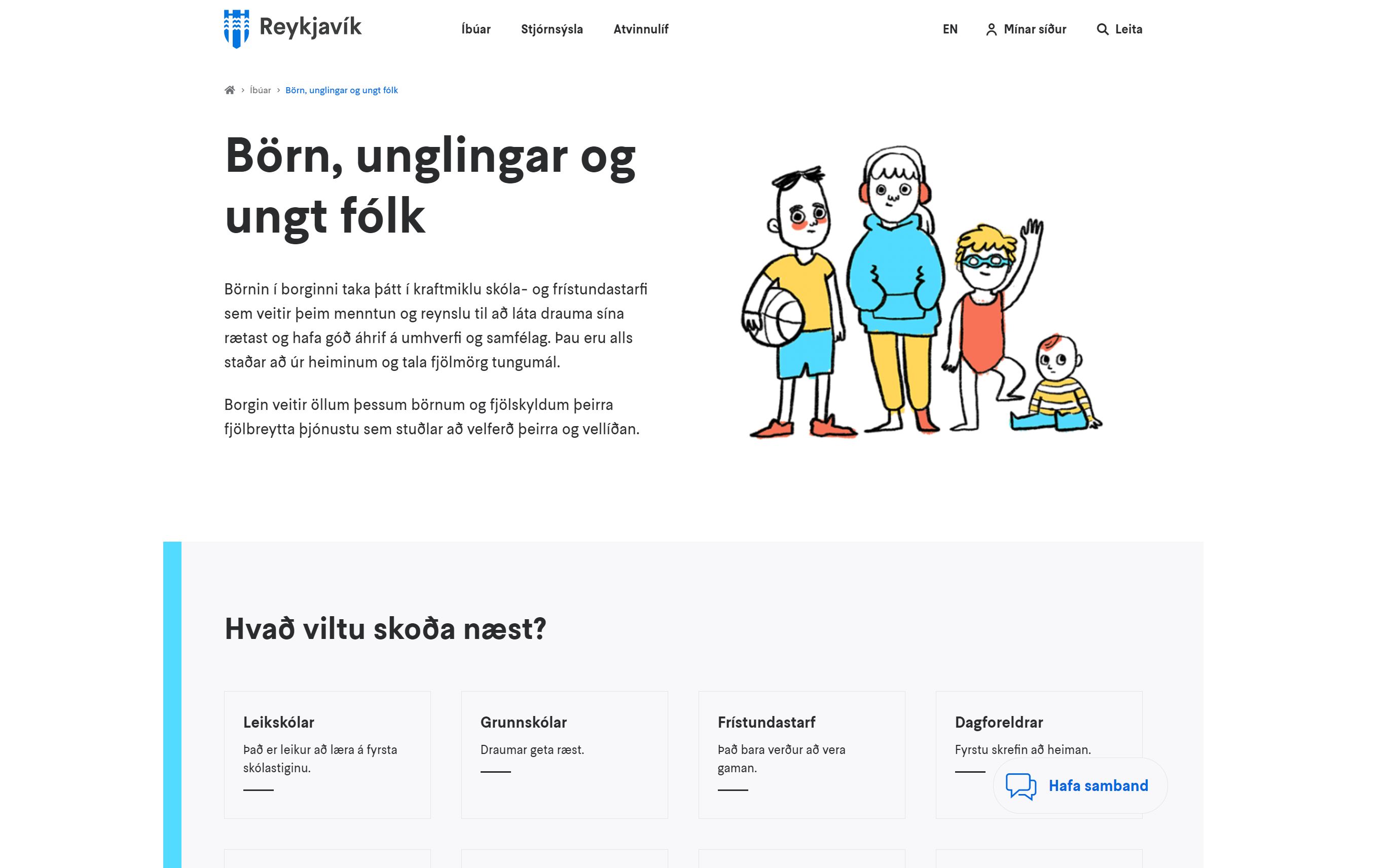
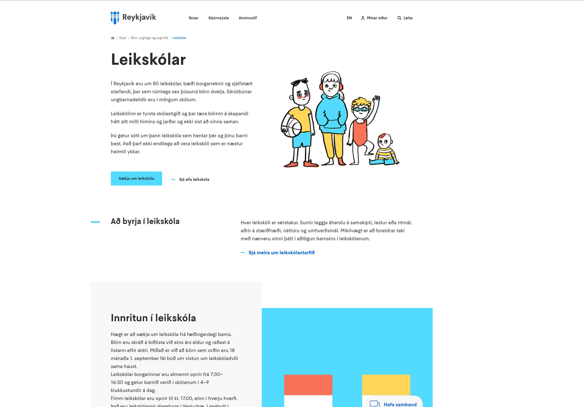
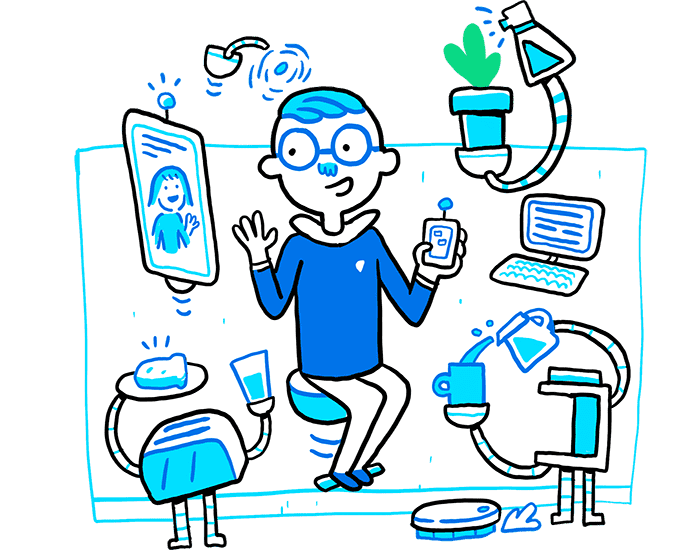
Illustrations
We use illustrations to enhance the text and content on the site. The City's diversity shines timelessly through the illustrations. The imagery is human-centric, portraying various landmarks and life in vibrant images. The style is hand-drawn, friendly, colorful, personal, and slightly quirky.
Clean interface icons were designed to guide people through processes. These are action buttons that people intuitively use without realizing that they are using them.